Brand crush
welovebranding
Identity by @welovebranding
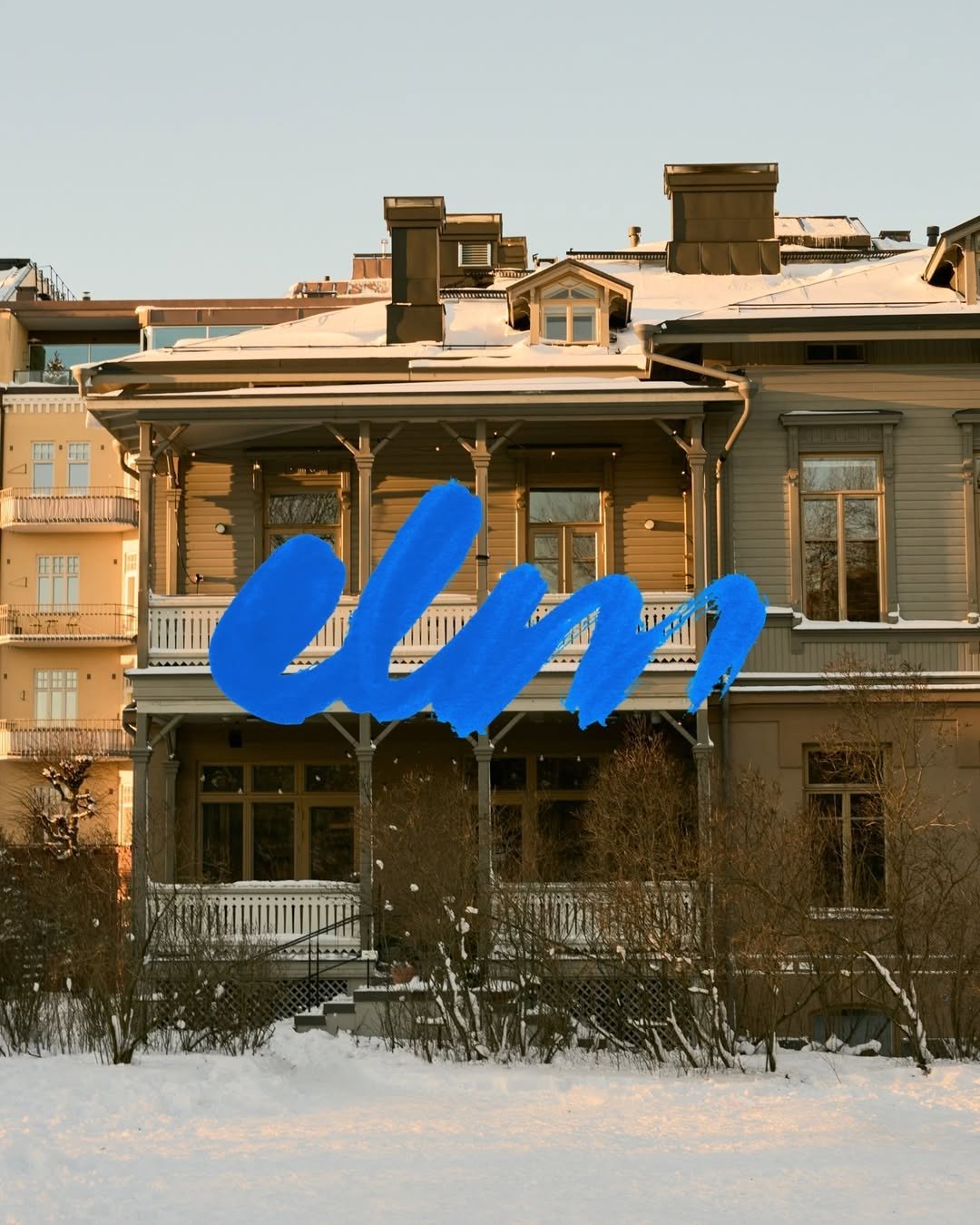
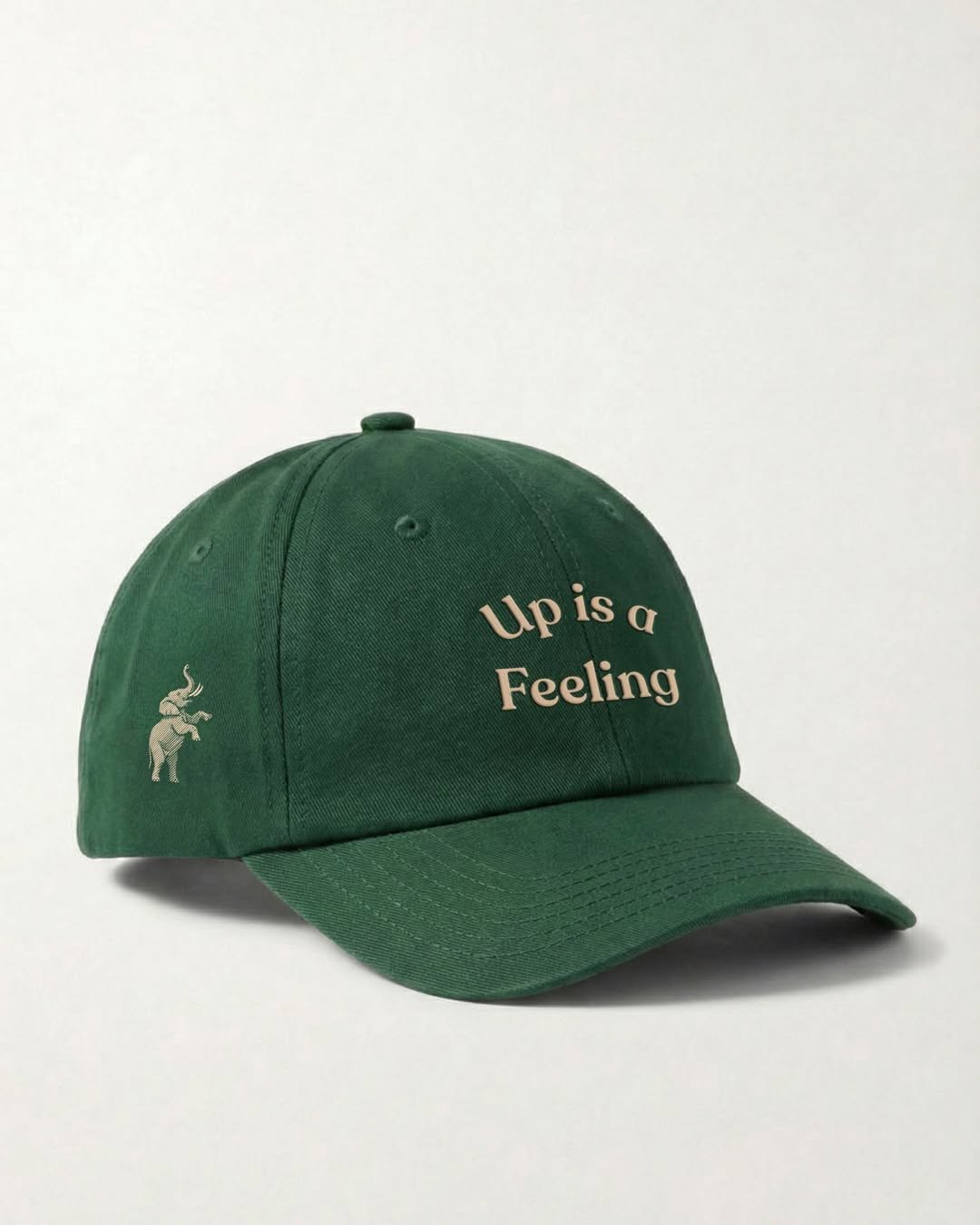
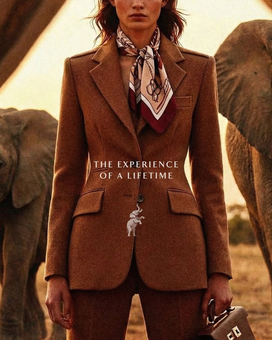
#typographic-stillnessnostalgic motion, wide-tracked serifs, earthy quiet
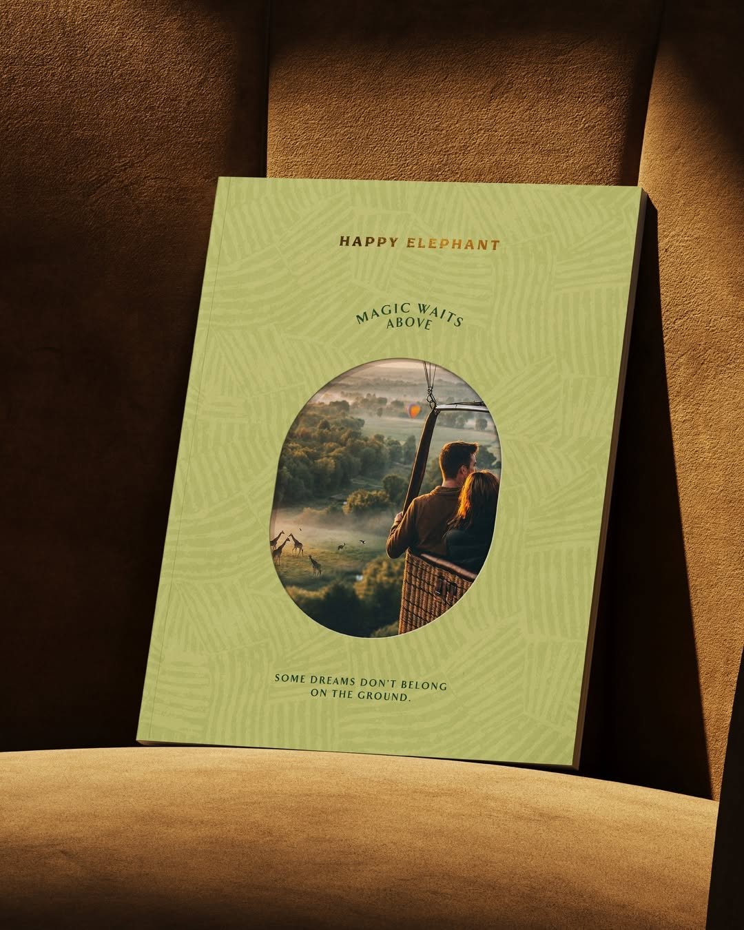
The motion blur on the basket and trees grounds this image in a fleeting moment, while the generously tracked serif typography stays perfectly sharp. Setting quiet, spacious text against an active background creates a tension that makes you stop scrolling.
The portable idea
We usually let a heavy logo do all the structural work. But framing a quiet, widely spaced wordmark against a texture or product with inherent movement gives the brand a sense of permanence. It is a very deliberate way to make a simple piece feel like a memory rather than an advertisement.
20. Mai 2026spotted via @welovebranding