Brand crush
@thebrandidentity
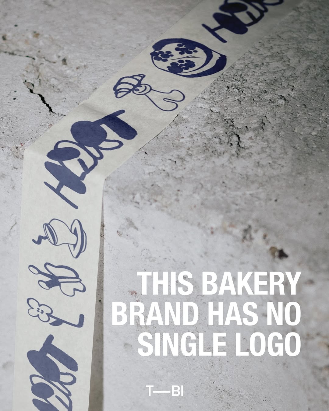
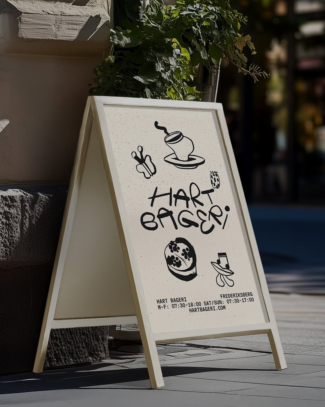
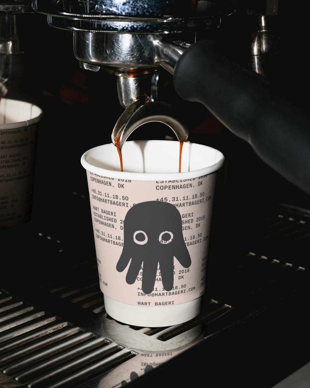
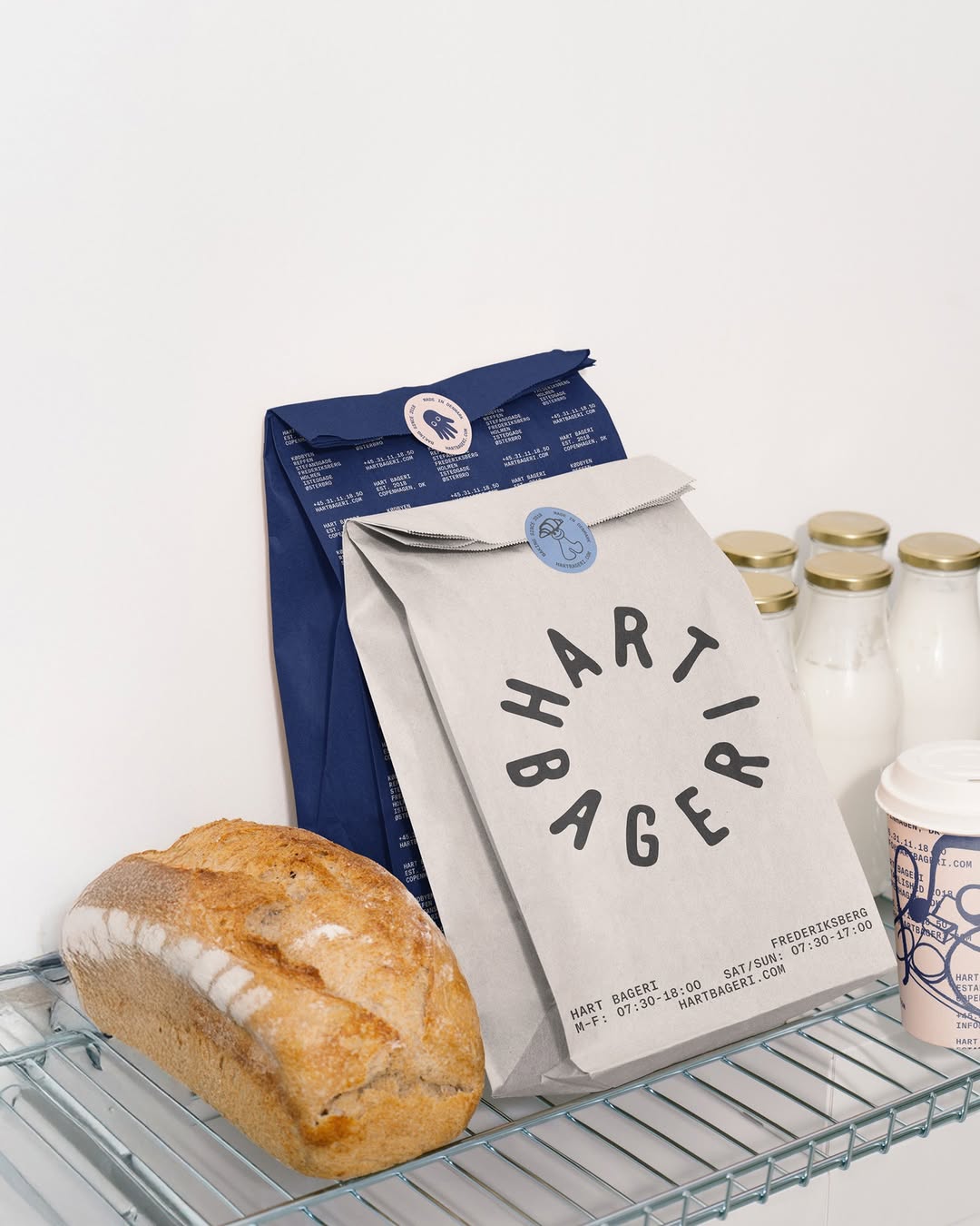
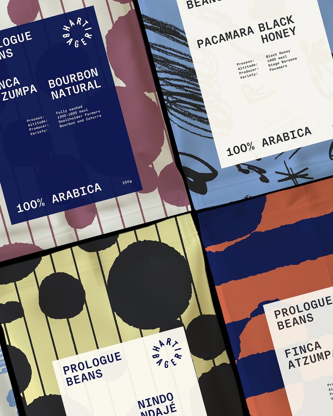
#fluid-brand-identityhuman-scale bakery, single-colour navy on natural kraft, loose illustration
They ditched the static corporate stamp for a family of loose, single-colour illustrations printed on natural paper tape. It turns functional packaging into a living pattern that feels human and completely unbothered.
The portable idea
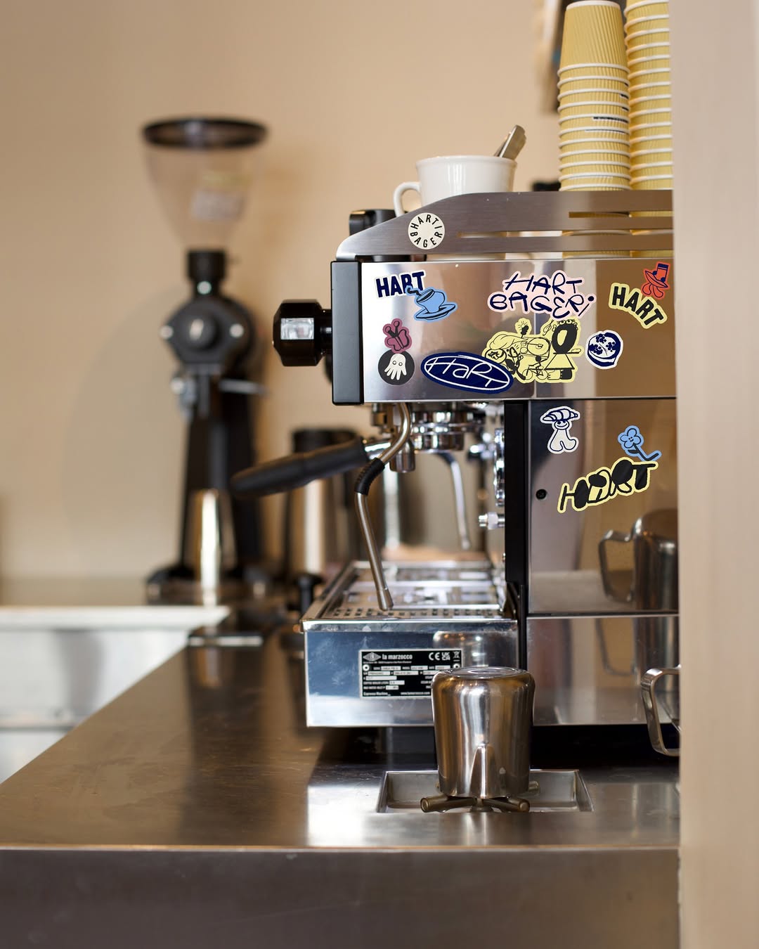
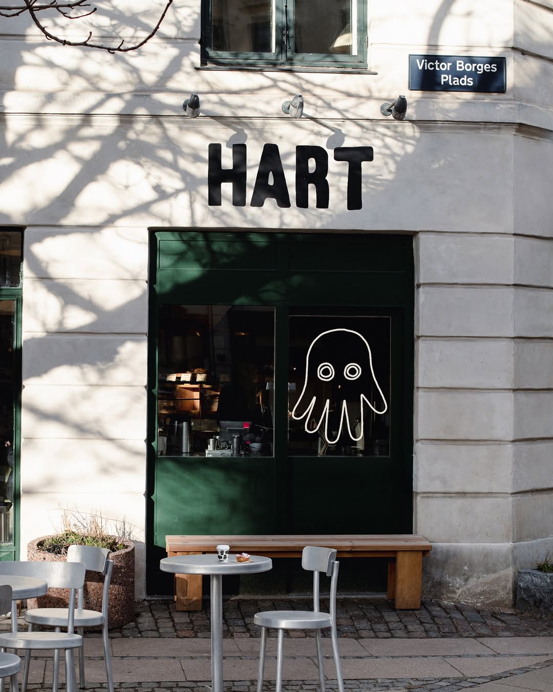
You do not always need to centre your primary logo to make something recognisable. Pull out the secondary brand elements — the hand-drawn icons, the typography, the quiet brand marks — and use them as a repeating pattern. It stops the product from looking like corporate merch and turns it into something people actually want to keep on their desk.
18. Mai 2026spotted via @thebrandidentity


