Brand crush
lukas.diemling
Identity by @thebrandidentity
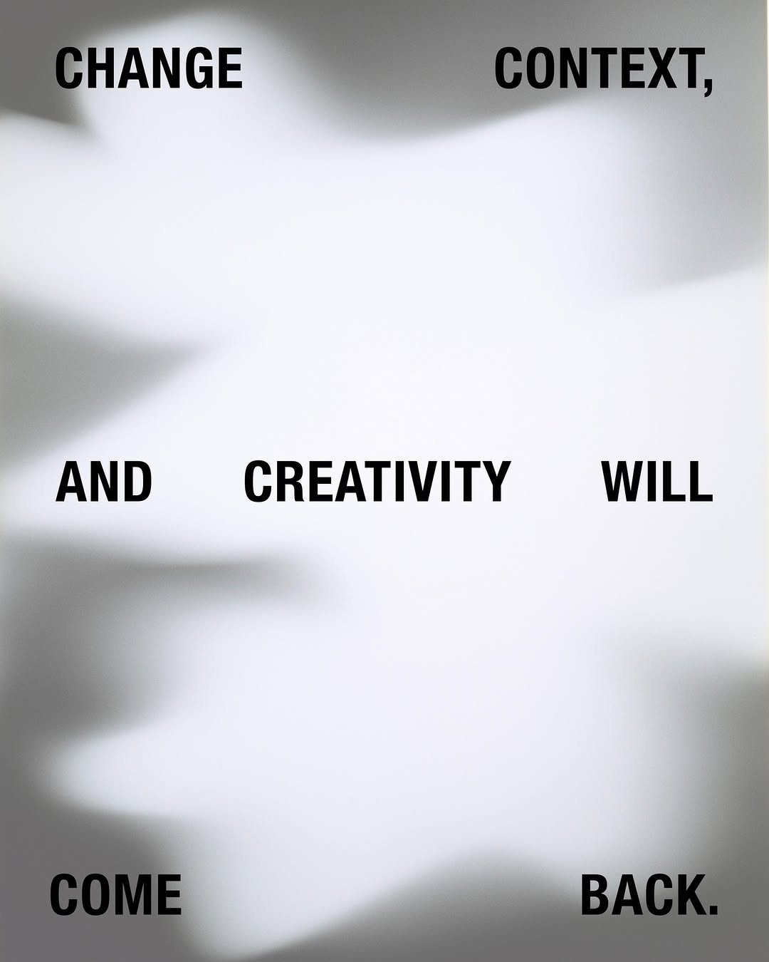
#selective-focus-illusionfrosted minimalism, optical depth, dry typography
It looks like you have misplaced your prescription glasses, but only for the background. The contrast between the crisp, heavy sans-serif type and the hazy, frosted shadow makes a flat surface feel three-dimensional.
The portable idea
Forcing a double-take is just a matter of messing with depth of field. If you drop razor-sharp text over a deliberately blurred graphic, the brain automatically tries to adjust the focus. It is a highly effective way to make a two-dimensional print job feel like a window.
20. Mai 2026spotted via @thebrandidentity