utilitarian typography, bleached kraft, terracotta ink (slide 2 of 10)
utilitarian typography, bleached kraft, terracotta ink (slide 3 of 10)
utilitarian typography, bleached kraft, terracotta ink (slide 4 of 10)
utilitarian typography, bleached kraft, terracotta ink (slide 5 of 10)
utilitarian typography, bleached kraft, terracotta ink (slide 6 of 10)
utilitarian typography, bleached kraft, terracotta ink (slide 7 of 10)
utilitarian typography, bleached kraft, terracotta ink (slide 8 of 10)
utilitarian typography, bleached kraft, terracotta ink (slide 9 of 10)
utilitarian typography, bleached kraft, terracotta ink (slide 10 of 10)
1 / 10

Brand crush

@ten.10.design

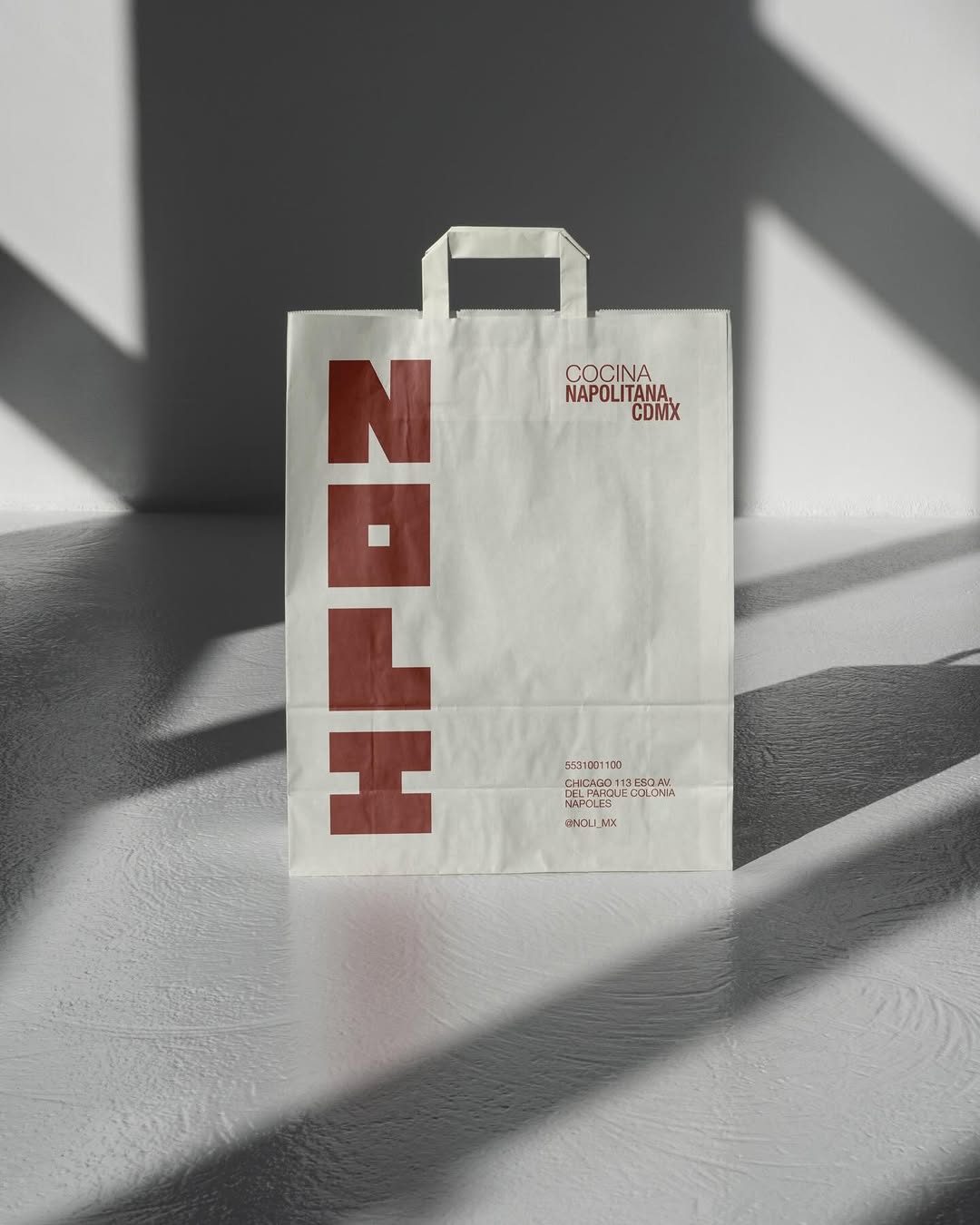
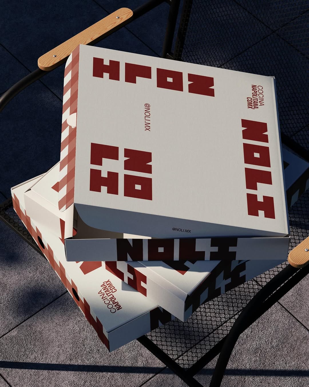
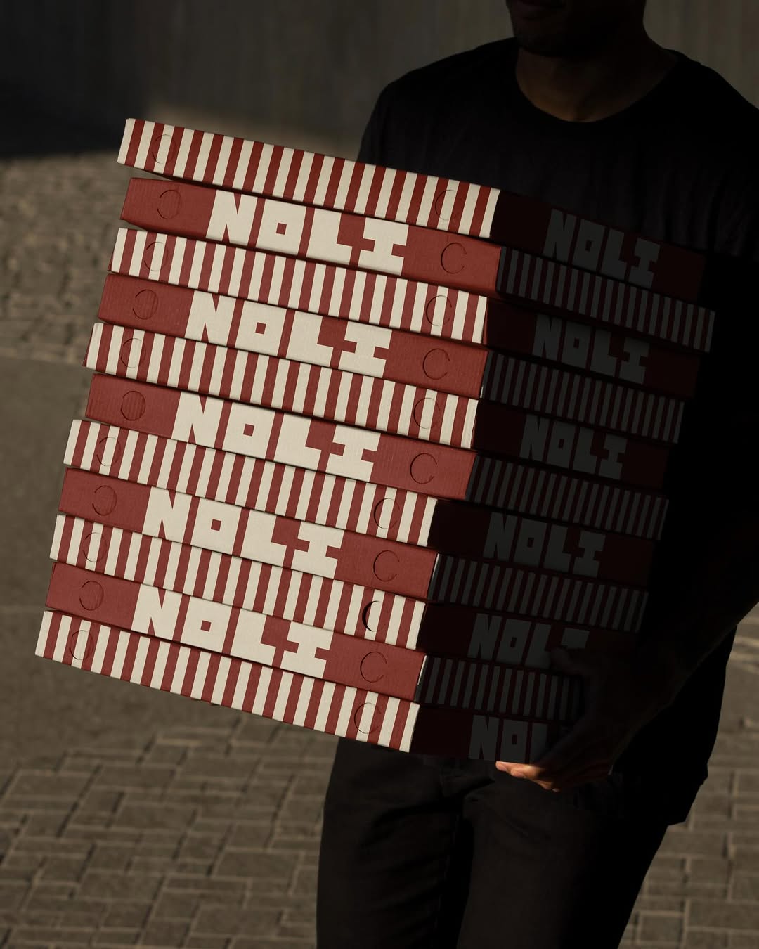
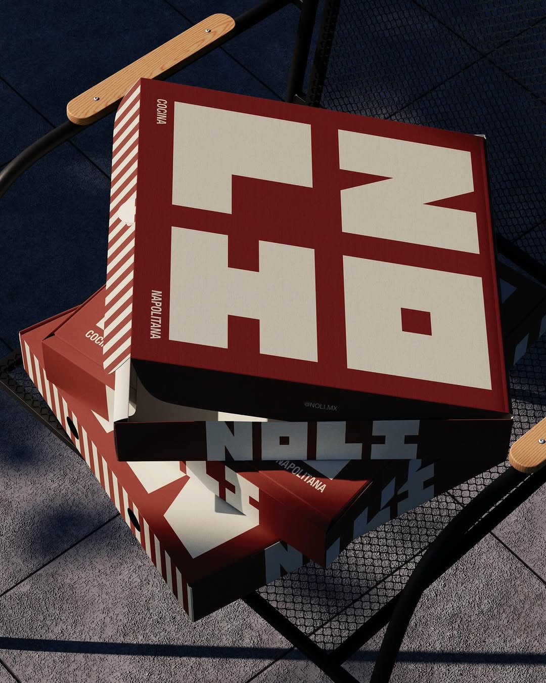
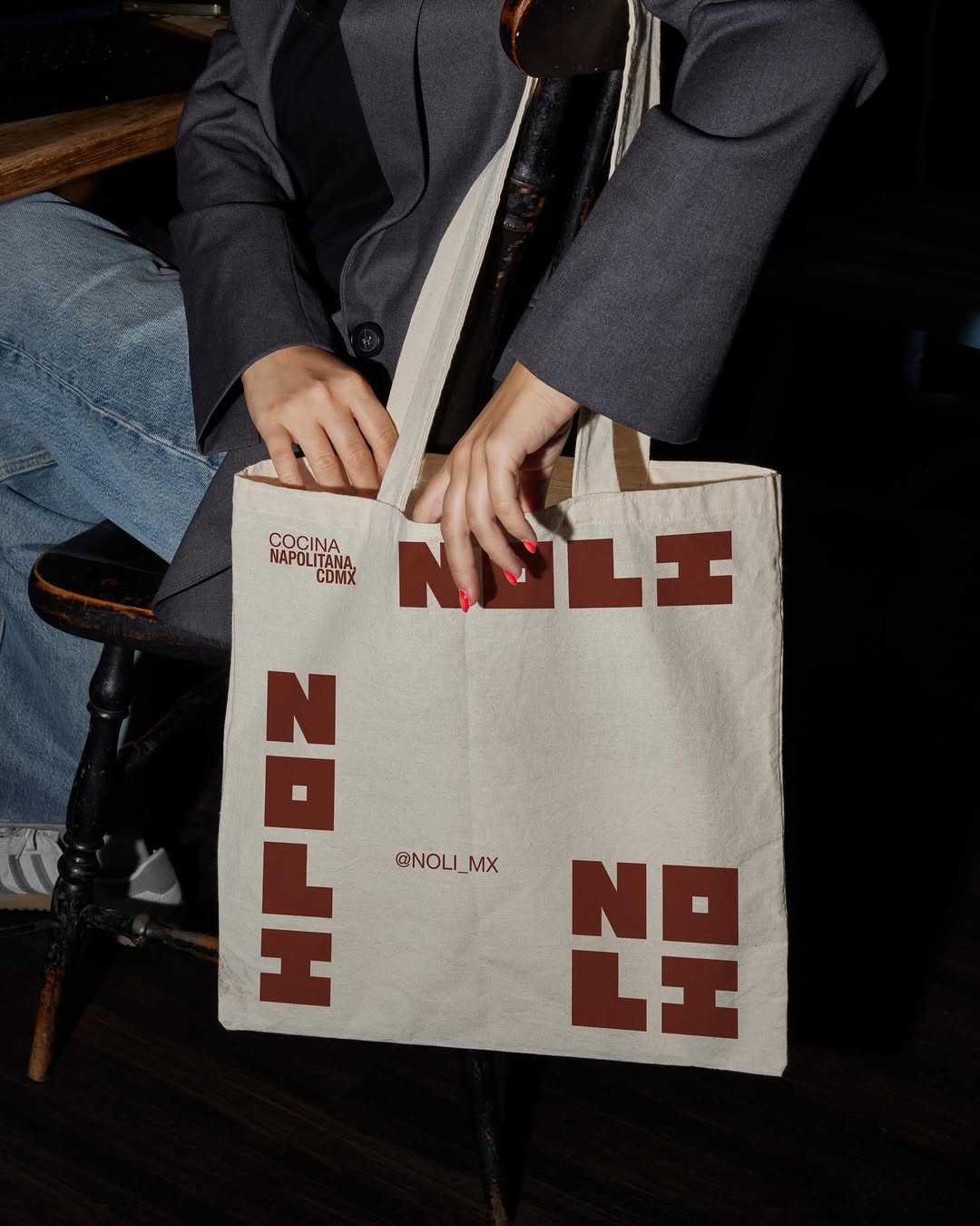
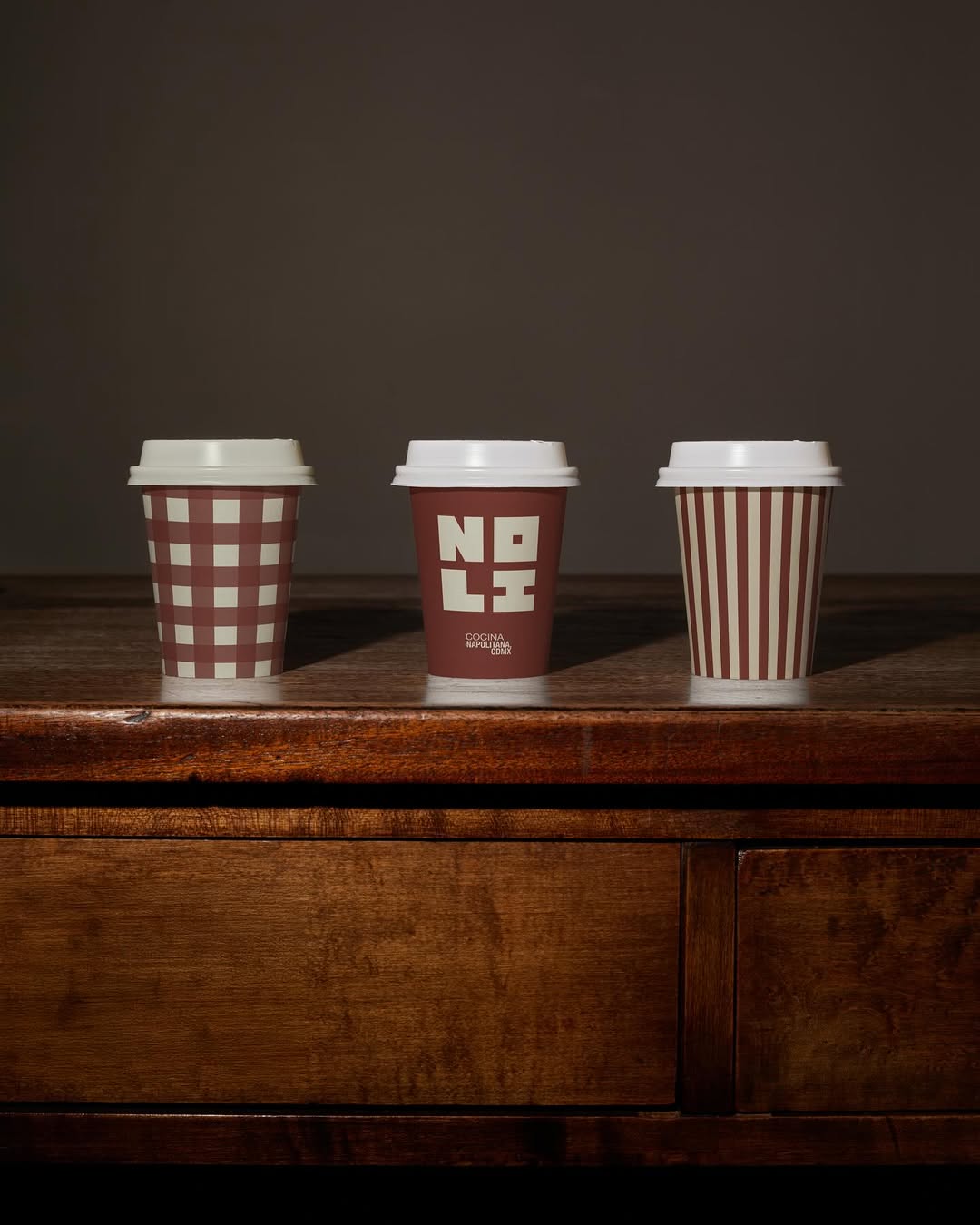
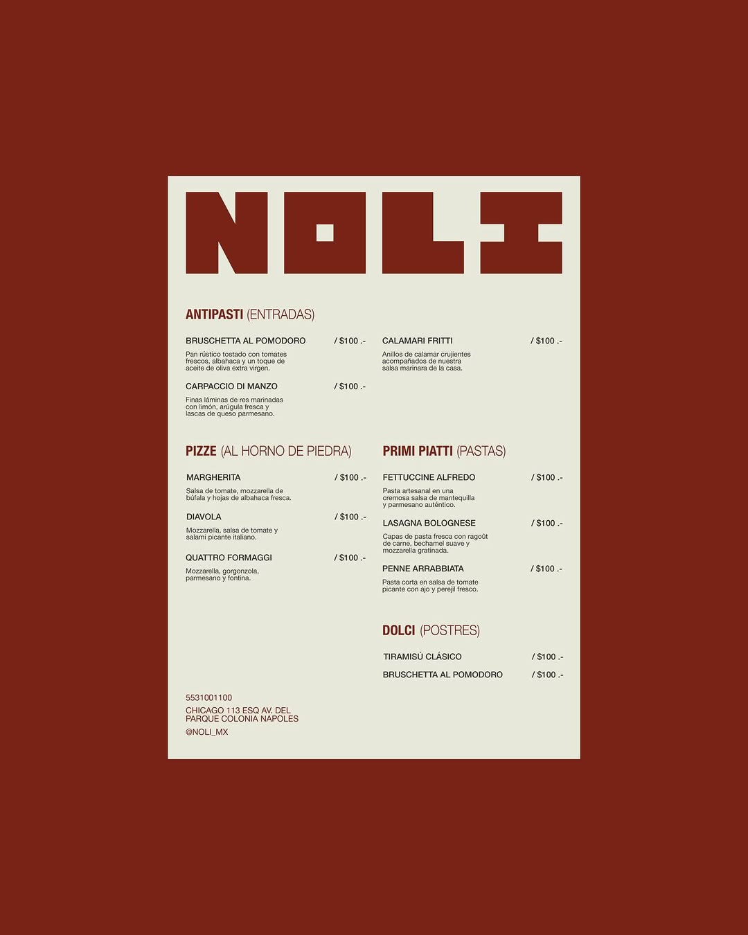
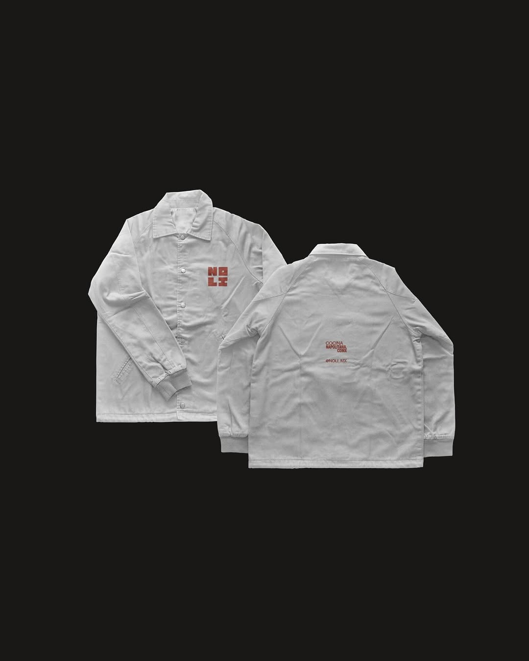
#oversized-vertical-typographyutilitarian typography, bleached kraft, terracotta ink

Single-colour flexo print on a bleached kraft stock proves you do not need a four-colour process to hold attention. They have used the sheer scale of the vertical block typography to turn a standard takeaway vessel into a walking billboard, while the matte terracotta ink grounds it in a tactile warmth.

The portable idea

Scale is the cheapest way to buy impact on a limited production budget. Dropping a single-colour, oversized wordmark down the vertical axis of a standard blank forces the eye to engage with the negative space. It turns an off-the-shelf paper stock into a structural design element without adding a cent to your unit cost.

21. Mai 2026spotted via @ten.10.design

Steal this for your brand world

Findie's translation of the move above into specific Sense2 products by industry. Pick the row that fits your brief — pricing is per piece at minimum order quantity.

Three more from the studio

More moments worth a look.

Want something like these?

Ask Findie for a quick conversation, or hand the brief to Susan and the team. Either works.