Brand crush
@ten.10.design
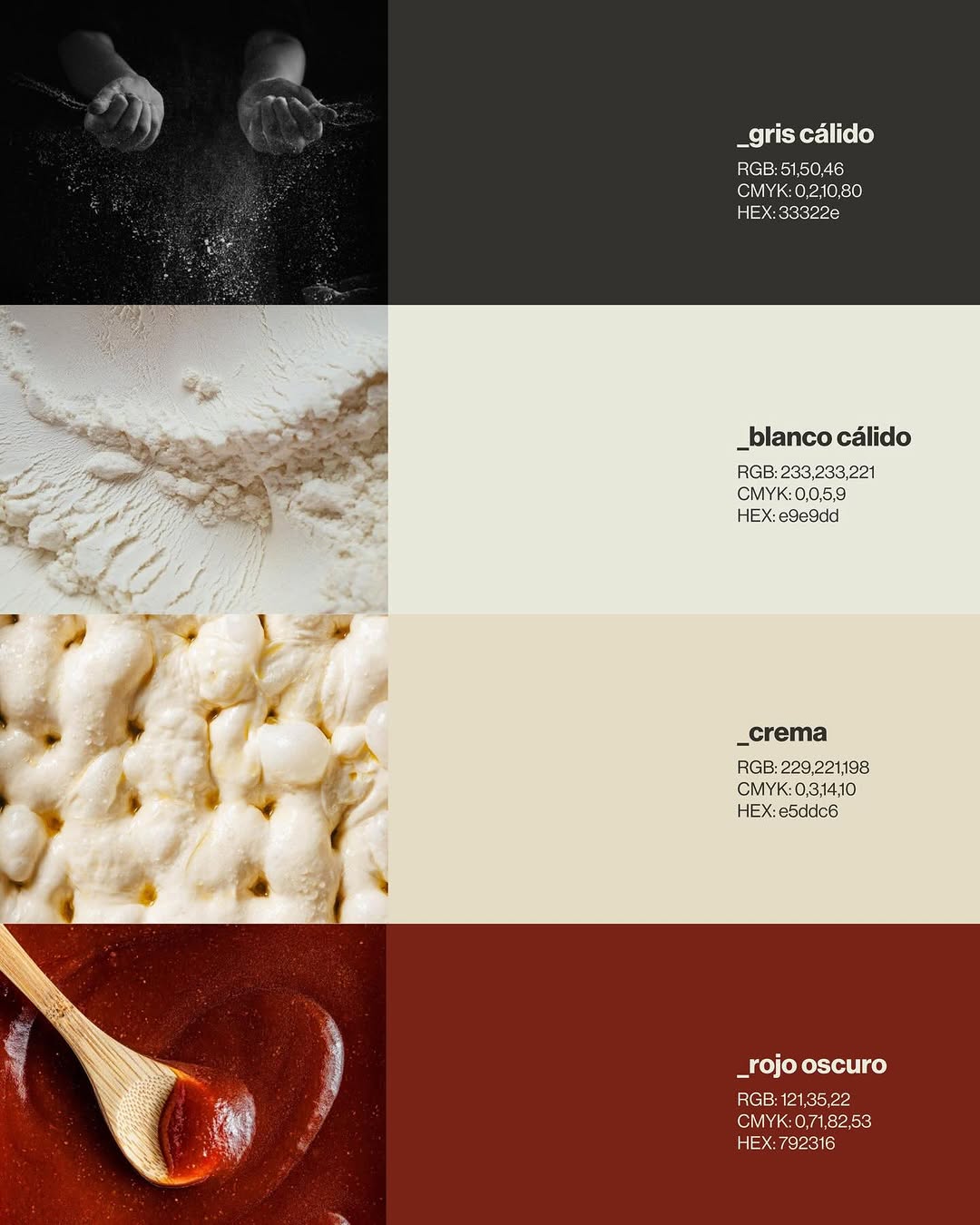
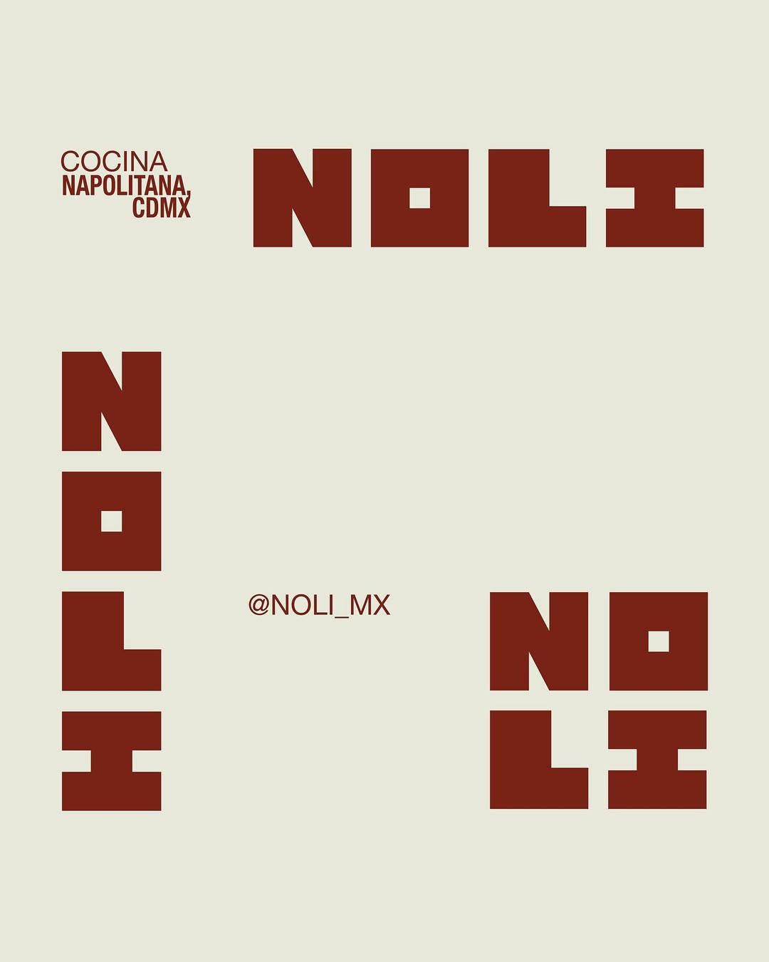
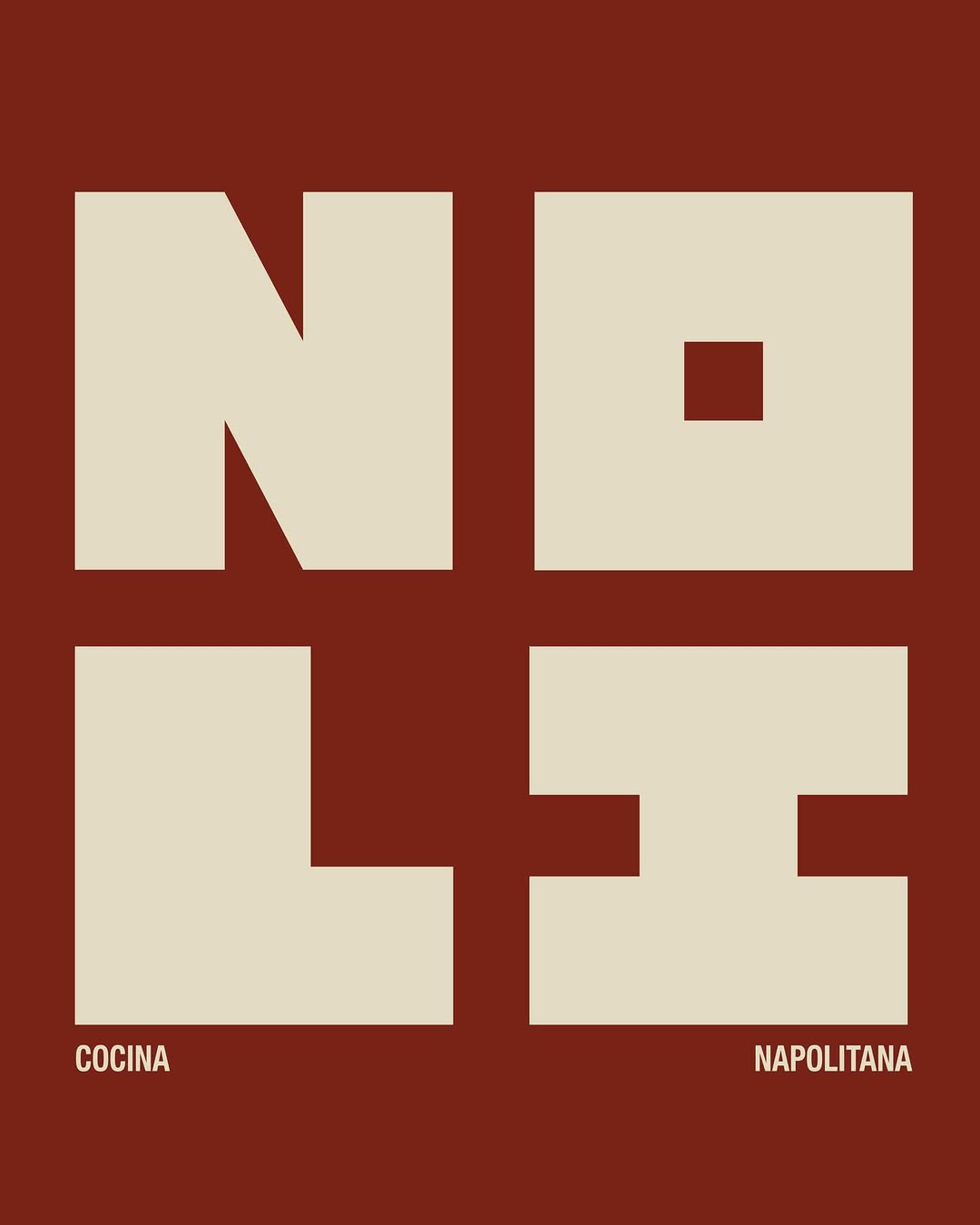
[ Naming + Branding Project ] NOLI — CDMX (Mexico)
Logo / Identidad / Colores / Tipografías / Texturas / Patterns
Prossimamente en Chicago 113, Esq Av. del Parque, Nápoles📍
21. Mai 2026spotted via @ten.10.design
Brand crush
[ Naming + Branding Project ] NOLI — CDMX (Mexico)
Logo / Identidad / Colores / Tipografías / Texturas / Patterns
Prossimamente en Chicago 113, Esq Av. del Parque, Nápoles📍
More moments worth a look.

Look at how the dense indigo pigment pools and holds at the outer edge, contrasting against the matte peach paper. The tension here lives between those highly structured, radiating fine lines in the centre and the completely organic, unpredictable ink bleed on the perimeter.

We created an identity that feels structured, editorial, and quietly authoritative. Accessible enough to guide, but solid enough to lead. Inspired by institutional systems and publishing, the visual language leans on typography, grids, and restraint. The brand behaves like a framework, not decoration. If your brand feels fragmented, it’s time to organize it. → Apply through the link in bio.

This design forces a collision between art and data to build instant category authority. By slapping a strict, grid-based technical label over a lush, full-bleed organic illustration, they position the product as both naturally sourced and scientifically crafted.
Ask Findie for a quick conversation, or hand the brief to Susan and the team. Either works.